


The place for design and photo tips, tricks, and resources for photographers and everyday photo lovers.
recent posts:
welome to the blog


hi. i'm adam.
the guy behind theMC.
designer.
photographer.
all around creative guy.
I turned my creative hobbies into careers and now create designs that build photographer brands and help everyday photo lovers share their biggest life memories.
where to find our designs
where to find our designs
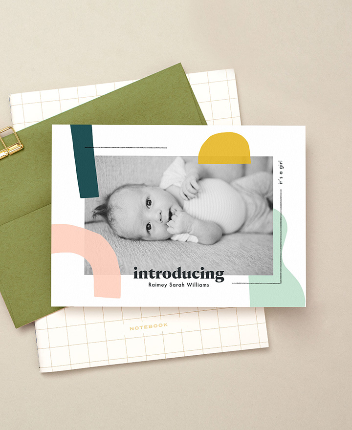
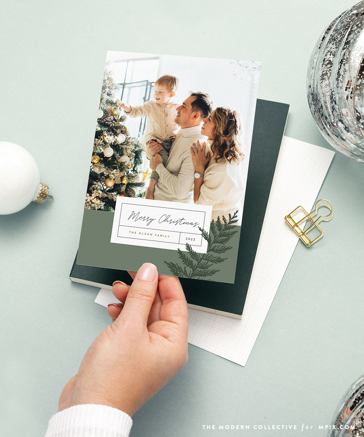
shop our exclusive mpix photo card collection

shop photographer tools & templates

the
MC
